Moderators: Elvis, DrVolin, Jeff
![]() by Harvey » Sun Dec 26, 2021 5:20 pm
by Harvey » Sun Dec 26, 2021 5:20 pm

![]() by alloneword » Mon Dec 27, 2021 8:34 am
by alloneword » Mon Dec 27, 2021 8:34 am
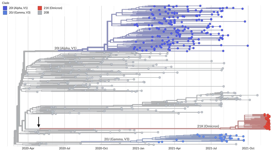
Omicron is not normal. No immediate progenitors are known; its closest relatives are viruses last seen in early- to mid-2020. The orthodox explanation for this awkward fact, is that it has spent the last 18 months lurking “in a geography with poor genomic surveillance … or … in a chronically infected individual.” The simpler explanation is that it leaked from a laboratory.
As el gato malo and others have indicated, evidence is strong that Omicron circulates preferentially in the vaccinated. In all likelihood, it is the result of gain-of-function research, in which SARS-2 was passaged repeatedly through convalescent or vaccinated plasma, in the hopes of helping the virus evade acquired immunity. The purpose of this research would be to anticipate future immune-escape variants that vaccines might target.
Omicron carries a series of highly unlikely and suspicious mutations in its spike protein. It is hard to imagine that these mutations can have arisen via natural processes, because all but one of them are nonsynonymous – that is, they code for different amino acid sequences. Starkly mutated variants favoured by natural selection should have a great many meaningless synonymous mutations as well.
Omicron’s ancestors may have spent a significant amount of time adapting to mouse cells, before re-entering human hosts. Omicron appears selected to replicate primarily in the bronchial tract. Deeper in the human lung, it functions far less efficiently than Delta or the first strains from Wuhan. This is probably why it causes mostly mild illness, and it is reminiscent of techniques used to make live attenuated influenza vaccines safer for use in humans. Such vaccines are cold-adapted, that is, selected to circulate primarily in the cooler upper respiratory tract rather than in the warmer, more vulnerable lungs.
The balance of the evidence is that Omicron leaked from a lab engaged in SARS-2 vaccine research. There are many possibilities: It might represent a live, attenuated virus vaccine used informally among researchers, that mutated back to virulence and escaped; it might have been released accidentally; it could even be an attempt to develop a self-spreading vaccine to immunise animals or third world populations.
UPDATE: Igor Chudov points to his own similar analysis from 2 December.


![]() by alloneword » Tue Dec 28, 2021 7:49 am
by alloneword » Tue Dec 28, 2021 7:49 am
![]() by alloneword » Tue Dec 28, 2021 8:36 am
by alloneword » Tue Dec 28, 2021 8:36 am
Are the Double Jabbed Removed from ICU Statistics to make Unvaccinated Numbers Higher?
Debunking some of the recent headlines
The Naked Emperor
1 hr ago
Headlines like the ones above appeared in all the British newspapers over the past few days, so I decided to take a closer look. The articles based their figures on a new study from ICNARC (Intensive Care National Audit & Research Centre) which was released on Christmas Eve and can be read here.
Abstract
The risk/benefit of Covid vaccines is arguably most accurately measured by an all-cause mortality rate comparison of vaccinated against unvaccinated, since it not only avoids most confounders relating to case definition but also fulfils the WHO/CDC definition of "vaccine effectiveness" for mortality.
We examine the latest UK ONS vaccine mortality surveillance report which provides the necessary information to monitor this crucial comparison over time. At first glance the ONS data suggest that, in each of the older age groups, all-cause mortality is lower in the vaccinated than the unvaccinated.
Despite this apparent evidence to support vaccine effectiveness - at least for the older age groups - on closer inspection of this data, this conclusion is cast into doubt because of a range of fundamental inconsistencies and anomalies in the data.
Whatever the explanations for the observed data, it is clear that it is both unreliable and misleading. While socio-demographical and behavioural differences between vaccinated and unvaccinated have been proposed as possible explanations, there is no evidence to support any of these.
By Occam's razor we believe the most likely explanations are ...
• Systematic miscategorisation of deaths between the different groups of unvaccinated and vaccinated.
• Delayed or non-reporting of vaccinations.
• Systematic underestimation of the proportion of unvaccinated.
• Incorrect population selection for Covid deaths.
![]() by alloneword » Fri Dec 31, 2021 4:34 pm
by alloneword » Fri Dec 31, 2021 4:34 pm

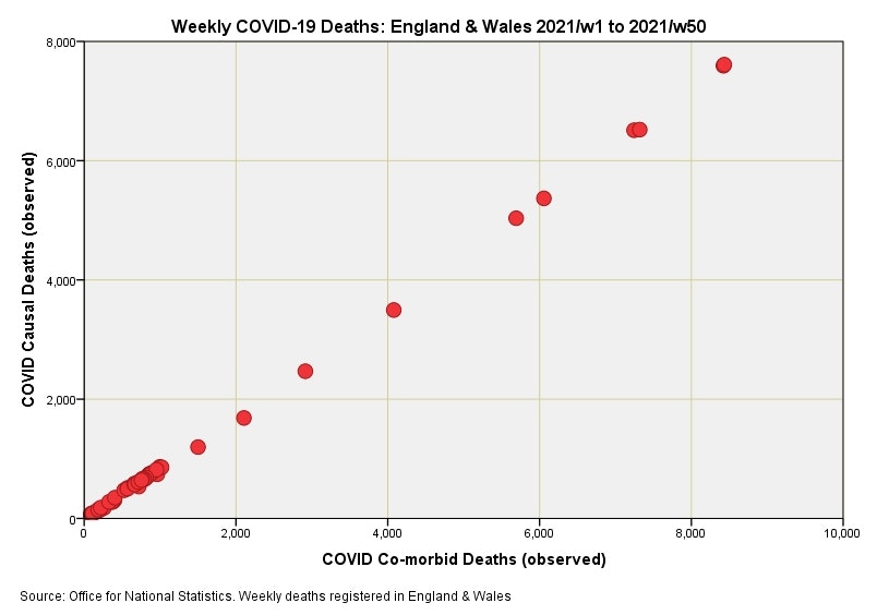
Dying With Precision: Causal vs. Co-morbid Death
Delving into the dashboard
John Dee
11 hr ago
I’ve been updating my datafiles with the latest figures obtained from UK GOV coronavirus dashboard/ONS and have come across a most curious anomaly. The ONS usefully provide weekly counts of causal and co-morbid deaths for respiratory conditions (ICD10 J00-J99), influenza/pneumonia (ICD10 J09-J18) and COVID-19 (ICD10 U07.1, U07.2, U09.9, U10.9) occurring within England & Wales and I just so happened to pop out a scatterplot for COVID-19 causal against COVID-19 co-morbid weekly counts just to get a feel of the relationship. In doing so I nearly blurted out my cuppa!
In the first slide you can see a near-perfect linear relationship between causal and co-morbid COVID-19 death. Any honest physician will tell you that this is utter b@llocks. Pearson’s correlation coefficient fetches up at a whopping great r = 0.967 (p<0.001, n=50), which is the sort of value befitting the precise realm of atomic physics rather than medicine. My guess is that somebody is using an algorithm to generate the data rather than counting real people in a real world.
...
![]() by alloneword » Sun Jan 02, 2022 2:57 pm
by alloneword » Sun Jan 02, 2022 2:57 pm
![]() by alloneword » Mon Jan 03, 2022 2:36 pm
by alloneword » Mon Jan 03, 2022 2:36 pm
Official statistics announcement
Cause of death coding in mortality statistics, software changes: January 2022
The differences in mortality data for England and Wales coded to ICD-10, produced by changing from cause of death coding using the software MUSE 5.5 to the updated version MUSE 5.8. The previous update from IRIS 4.2.3 to MUSE 5.5 occurred in January 2020. An account of the differences produced by changing from cause of death coding from IRIS 4.2.3 to MUSE 5.8 is also provided.
![]() by alloneword » Mon Jan 03, 2022 7:24 pm
by alloneword » Mon Jan 03, 2022 7:24 pm
Aging populations in Europe and the upcoming baby boomer ICU and death wave: Records in absolute age unadjusted numbers every year for the next 20 years in Europe is unavoidable. This is normal and simply the result of the boomer group moving through the end of life age bins. In order to avoid a general panic every winter, mortality must be age adjusted or even better only analysed by age group and not aggregated into one total number mortality or mortality rate number. Do not panic based on a Simpson’s paradox.
![]() by alloneword » Thu Jan 06, 2022 6:13 am
by alloneword » Thu Jan 06, 2022 6:13 am
Press release
Confirmatory PCR tests to be temporarily suspended for positive lateral flow test results
The UK Health Security Agency (UKHSA) announces temporary changes to confirmatory PCR tests.
From:
UK Health Security Agency
Published
5 January 2022
From 11 January in England, people who receive positive lateral flow device (LFD) test results for coronavirus (COVID-19) will be required to self-isolate immediately and won’t be required to take a confirmatory PCR test.
This is a temporary measure while COVID-19 rates remain high across the UK. Whilst levels of COVID-19 are high, the vast majority of people with positive LFD results can be confident that they have COVID-19.
Lateral flow tests are taken by people who do not have COVID-19 symptoms. Anyone who develops 1 of the 3 main COVID-19 symptoms should stay at home and self-isolate and take a PCR test. They must self-isolate if they get a positive test result, even if they have had a recent negative lateral flow test – these rules have not changed.
The new approach reflects similar changes made this time last year in January 2021, when there was also a high prevalence of infection meaning it was highly likely that a positive LFD COVID-19 result was a true positive. This meant confirmatory PCRs were temporarily paused and reintroduced in March 2021 following a reduction in prevalence.
The UK’s testing programme is the biggest in Europe with over 400 million tests carried out since the start of the pandemic. Since mid-December, 100,000 more PCR booking slots have been made available per day and capacity continues to be rapidly expanded, with delivery capacity doubled to 900,000 PCR and LFD test kits a day.
Under this new approach, anyone who receives a positive LFD test result should report their result on GOV.UK and must self-isolate immediately but will not need to take a follow-up PCR test.
After reporting a positive LFD test result, they will be contacted by NHS Test and Trace so that their contacts can be traced and must continue to self-isolate.
There are a few exceptions to this revised approach.
First, people who are eligible for the £500 Test and Trace Support Payment (TTSP) will still be asked to take a confirmatory PCR if they receive a positive LFD result, to enable them to access financial support.
Second, people participating in research or surveillance programmes may still be asked to take a follow-up PCR test, according to the research or surveillance protocol.
Finally, around one million people in England who are at particular risk of becoming seriously ill from COVID-19 have been identified by the NHS as being potentially eligible for new treatments. They will be receiving a PCR test kit at home by mid-January to use if they develop symptoms or if they get a positive LFD result, as they may be eligible for new treatments if they receive a positive PCR result. This group should use these priority PCR tests when they have symptoms as it will enable prioritised laboratory handling.
In line with the reduced self-isolation approach announced on 22 December, anyone who tests positive will be able to leave self-isolation 7 days after the date of their initial positive test if they receive 2 negative LFD results, 24 hours apart, on days 6 and 7.
Rapid lateral flow tests are most useful at identifying COVID-19 in people without any symptoms. The tests are over 80% effective at finding people with high viral loads who are most infectious and most likely to transmit the virus to others.
Analysis by NHS Test and Trace shows LFD tests to have an estimated specificity of at least 99.97% when used in the community. This means that for every 10,000 lateral flow tests carried out, there are likely to be fewer than 3 false positive results. LFD tests identify the most infectious people. These people tend to spread the virus to many people and so identifying them remains important.
Secretary of State for Health and Social Care Sajid Javid said:
We have built a world-leading testing system and our testing capacity is the largest in Europe. This has helped save lives and protect millions of people from COVID-19. It forms a crucial line of defence alongside vaccines and antivirals.
As Omicron cases continue to rise the demand for tests has grown rapidly across the globe. We’re putting plans in place to manage the demand for PCR tests in the UK so we can ensure that those who most need tests can continue to access them.
Chief Executive of UKHSA, Dr Jenny Harries, said:
While cases of COVID-19 continue to rise, this tried-and-tested approach means that LFDs can be used confidently to indicate COVID-19 infection without the need for PCR confirmation.
It remains really important that anyone who experiences COVID-19 symptoms self-isolates immediately. They should also order a PCR test on GOV.UK or by phoning 119.
I’m really grateful to the public and all of our critical workers who continue to test regularly and self-isolate when necessary, along with other practical and important public health behaviours, as this is the most effective way of stopping the spread of the virus and keeping our friends, families and communities safe.
Yesterday the Prime Minister announced the government will provide 100,000 critical workers in England with free lateral flow tests to help keep essential services and supply chains running.
Critical workers will be able to take a test on every working day and the provision of precautionary testing will be for an initial 5 weeks. This will help to isolate asymptomatic cases and limit the risk of outbreaks in workplaces, reducing transmission while COVID-19 cases remain high.
The full range of critical workers have been identified by the relevant departments and government will contact these organisations directly on the logistics of the scheme this week. Roll-out will start from Monday 10 January.
Tests will be separate from public sectors who already have a testing allocation with UKHSA, such as adult social care or education, and separate to those delivered to pharmacies and homes, so those channels will not be impacted by the new scheme.
We are now distributing around 600,000 packs of LFD tests (each containing 7 tests) on GOV.UK directly to homes every day (more than 50% higher than last week).
![]() by alloneword » Sat Jan 08, 2022 10:47 am
by alloneword » Sat Jan 08, 2022 10:47 am
The COVID "cure" is worse than the disease.
Analysis of life-years lost in England shows a 76% increase in 2021 over 2020 because younger people are dying at much higher relative rates.
Joel Smalley
![]() by MacCruiskeen » Mon Jan 10, 2022 10:20 am
by MacCruiskeen » Mon Jan 10, 2022 10:20 am

![]() by alloneword » Wed Jan 12, 2022 5:19 am
by alloneword » Wed Jan 12, 2022 5:19 am
Results Twenty-five seroprevalence surveys representing 14 countries were included. Across all countries, the median IFR in community-dwelling elderly and elderly overall was 2.9% (range 0.2%-6.9%) and 4.9% (range 0.2%-16.8%) without accounting for seroreversion (2.4% and 4.0%, respectively, accounting for 5% monthly seroreversion). Multiple sensitivity analyses yielded similar results. IFR was higher with larger proportions of people >85 years. Younger age strata had low IFR values (median 0.0013%, 0.0088%, 0.021%, 0.042%, 0.14%, and 0.65%, at 0-19, 20-29, 30-39, 40-49, 50-59, and 60-69 years even without accounting for seroreversion).
Conclusions The IFR of COVID-19 in community-dwelling elderly people is lower than previously reported. Very low IFRs were confirmed in the youngest populations.
![]() by alloneword » Wed Jan 12, 2022 11:10 am
by alloneword » Wed Jan 12, 2022 11:10 am
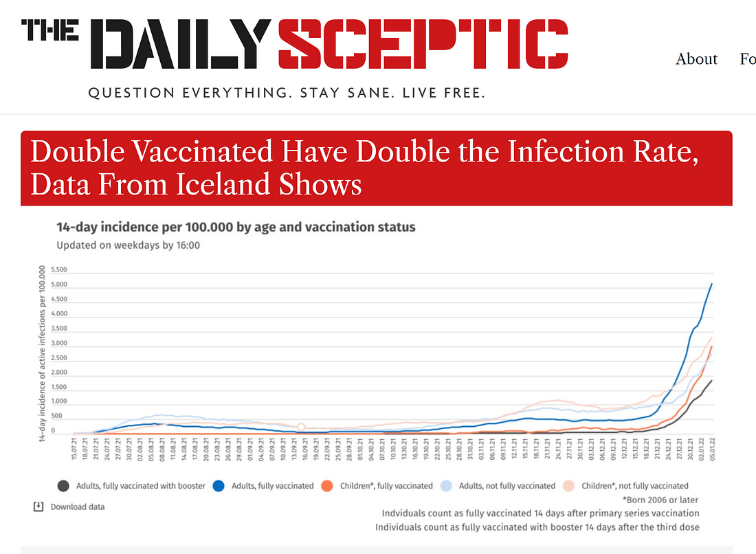
bayesian datacrime: defining vaccine efficacy into existence
how the definitions of "full vaccinated" and now "boosted" are exaggerating (and possibly creating from whole cloth) VE and turning the data into gibberish
welcome to another edition of “stats with cats.”
today’s topic: how to use definitional legerdemain to make products look like they work, taint data, and fool the unwary.
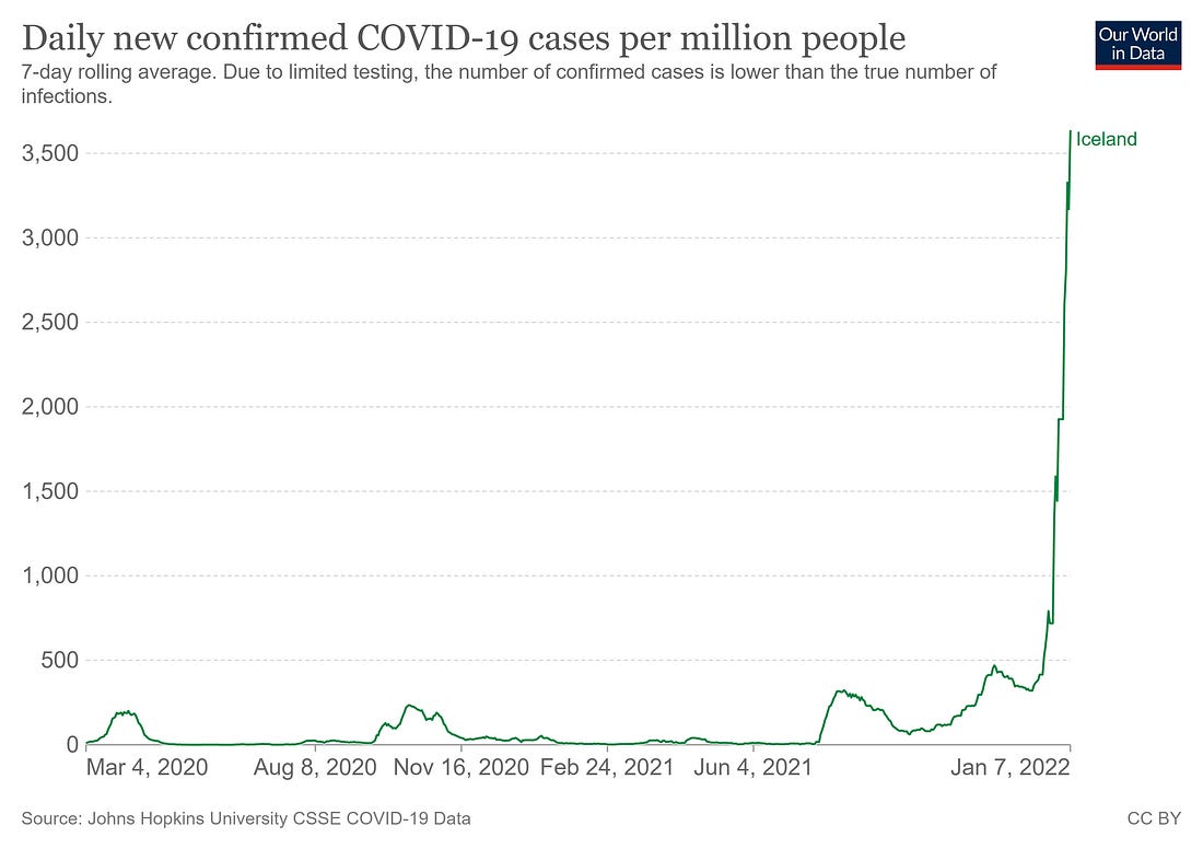
let’s start in highly vaccinated iceland where, despite ~80% vaccination rates and over 50% of the population boosted, cases are literally exploding.
testing roughly doubled, but this is still a DRAMATIC move even adjusted for sample rate.
]
many have argued that vaccines are helping. this data makes it look like they are not. the vaccinated are getting covid at something like twice the rate of the unvaxxed.
but, one might argue, this DOES make it look like boosters work. but this is not so either and that’s what i’d like to dig into.
you could hide hannibal crossing the alps on elephants in the definitional holes here.
this is just a fouling of the bayesian process.
let’s take a simple, contrived example. for this we will assume:
vaccines have zero effect on stopping covid. they do not make it more or less likely you will contract it. they are, literally, saline.we have 200 people.
so what happens over a month?
100 are unvaxxed.
100 are double vaxxed.
all have a 10% chance of getting covid each 2 weeks.
20 of the people who were vaxxed get boosted at the beginning of the period.
no one gets re-infected.of the 100 unvaxxed, 10 get cov first 2 wks, then 9 the second. 19 total. 19%.
of the 80 double vaxxed, 8 get covid first 2 wks, then 7.2 the next. 15.2 total. 19%.
of the 20 boosted, 2 get covid first 2 wks, then 1.8 the second. 3.8 total. 19%.
ok, so far, so boring. but here is where you want to pay attention, because this is where the trick resides:
you do not count the boosted as boosted until 2 weeks after the shot. this is the definition everyone has been using. it was used in the drug trials for these vaccines as well. and doing this is full blown bayesian datacrime.
in this society scale data, it has the following effect:
the 2 people in the boosted group who got covid in the first 2 week period get moved. they are not counted as boosted cases. they are counted as double vaxxed cases.
so instead of actual risk based on behavior, we get:unvaxxed: 19 total = 19%
double vaxxed: 17.2 total = 21%
boosted: 1.8 total = 10%
and faster than you can say “record quarter for pfizer” you get apparent VE where there is none. we’re literally measuring saline.
boosters now show a 48% vaccine efficacy (VE) and double vaxxed falls to -10%.
and the faster you ramp boosters, the worse it makes double vaxxed seem. this literally becomes a product that sells itself because the statistical process is totally rigged.
if you up the number from 20% boosted to 40%, VE for double vaxxed drops to -36%. this makes the need for a booster look much more acute.
this makes it quite hard to take those curves at face value. they could mean all sorts of things.
this statistical sleight of hand from playing silly buggers with the definitions has literally taken a product (boosters) that has zero effect and made it look like 48% VE.
this same game was played with early societal vaxx studies as well except for the risk enhancement pre “dose 2 +14 days” was all shifted to the unvaccinated.
it would work like this:100 unvaxxed, 19 covid = 19%
100 vaxxed, 10 covid first 2 wks, 9 second 2 wks = 19 covid = 19%
0% VE.
but, because the 10 cases in the first 2 weeks get shifted to “unvaxxed” it reads out as29 unvaxxed = 29%
9 vaxxed = 10%
so you get 66% VE from saline.
this misallocation of cases and resultant mismatch of patient exposure days is a nifty little trick, no? (and yes, this is literally how most of these analyses are being done. to even approximate the boosted % today and comp to reported breakthroughs, you have to use the boosted rate from 2 weeks ago. this leads to the other common abuse/mistake:
mishandle the cohort sizes. this is easy to do if you take, say, boosted cases over a period of 4-6 weeks and then assume the boosted rate was whatever it is now instead of normalizing for exposure days across that period. this becomes extreme in its expression if the boosted rate is changing rapidly as it has been in so many places.
iceland boosted % went from 20% to 50% in a month.
let’s look at what that means.
let’s go back to our original case that “vaccine = saline” and 10% exposure every 2 weeks and look just at one 2 week period.
100 people. boosted b = 20 at start, 40 at end so “fully vaxxed” = vf = 55 at start and 35 at end. we’ll hold “unvaxxed” constant at uv= 25.
if each has 10% infection then using number at start we getuv = 2.5 in 25
b= 2 in 20
fv = 5.5 in 55.
10 cases total, 10% in each. this is what gets reported and what gets expressed. it’s 0 VE.
but now apply the end of period cohort size instead now we’re reporting:uv = 2.5 in 25 = 10%
b = 2 in 40 = 5%
fv = 5.5 in 35 = 15.7%
so, suddenly, double vaxxed looks like -57% VE and boosted looks like +50% VE.
but it’s all saline. no drug effect is present. we’re just not accounting for cohort size properly and counting “boosted today” vs “cases reported in those boosted 14 or more days ago” in a system with rapidly changing values.
this gets even worse as reporting lag for cases likely adds another 3-7 days.
this make collecting this data from society scale info VERY difficult and severely prone to error that adds strong, predictable bias toward making whatever group vaxxed most recently look like vaccine were working and to then have that apparent efficacy fade as the growth their group slows.
it’s not viral resistance or even drug fade. it’s just biased math. note that i am not saying that this proves there is no vaccine efficacy, though there is LOTS of data showing that (and negative VE on cases besides).
UK data:
i am pointing out a mathematical issue that is plaguing these analyses to the point of being outright datacrime.
this is pretty awful and governments, scientists, and health agencies alike are falling for it (or using it to manipulate data).
this is pretty outlandishly bad.
well, buckle up because it gets MUCH worse.
there is quite a lot of evidence that these vaccines trigger a ~2 week window of significant immune suppression. it has been shown to roughly double disease susceptibility in healthy people (and this was done during a period of low incidence and pre omi. it could easily be far higher now.)
a detailed walkthrough on this issue along with sourcing can be found here:
bad cattitudewhy "vaccinated covid deaths/hospitalizations" are being counted incorrectlylet’s start with an example: you’re a soldier pinned down in a foxhole. across the field from you is a bunker. getting into the bunker will greatly reduce your risk of being shot. but the field you must cross is wide open to enemy fire. if you’re going to make the choice to run for the bunker, on what would you base it…Read more4 months ago · 205 likes · 84 comments · el gato malo
note the concordance here with the period of immune suppression and the definitions. this 2 week “worry window” of risk enhancement is exactly the period that these definitions will shift.
those who get a booster are, for at least 14 days, MUCH more likely to get sick. this is high hit probability fire to run across. the risk, in the middle of an omicron surge, is very high to begin with. this is not a time you want to be immuno-suppressed.
and if they do get sick, likely because they got the booster, they are not counted as a booster illness. they get counted as a “double vaxxed.”
so if we take our example above and add the new salient that those who get a booster are twice as likely to get sick in the first 2 weeks, now we get some really severe data shifting.
of the 100 unvaxxed, 10 get cov first 2 wks, then 9 the second. 19 total. 19%.
of the 80 double vaxxed, 8 get covid first 2 wks, then 7.2 the next. 15.2 total. 19%.
of the 20 boosted, 4 get covid first 2 wks, then 1.6 the second. 5.6 total. 28%.
clearly, boosted is the highest risk group in our example.
but it will read as the lowest.
this is because the 4 in the first 2 weeks will get moved. they get counted as “double vaxxed”.
so instead of actual risk based on behavior, we get:unvaxxed: 19 total = 19%
double vaxxed: 19.2 total = 24%
boosted: 1.6 total = 8%
this definitional deception has literally taken a product that increased risk by 47% and made it look like 58% VE. note that this is UP from the 48% it reported as saline. yup, swapping in a product that does actual harm will, under these measurement modalities, read as HIGHER vaccine efficacy than saline. this calculation mistakes harm for benefit.
it works the same way if you mis-size cohorts temporally as outlined above.
if boosting continues at the same rate in the next 2 weeks you’re looking at 40% boosted at end of period AND the boosted group case count rises to 7.2 (36%).
you get a 19% rate in unvaxxed
but 7.2/40 = 18%. boosters look like they are working even though they had nearly double the risk rate.
and VE for “double vaxxed” implodes to -33%.
and we have not yet accounted for reporting lag.
or the fact that these two issues are not mutually exclusive and can compound multiplicatively.
play the same thing out in an initial vaccination campaign and you get:100 unvaxxed, 19 covid = 19%
100 vaxxed, 20 covid first 2 wks, 8 second 2 wks = 28 covid = 28%
that’s negative 47% VE.
but, because the 20 cases in the first 2 weeks get shifted to “unvaxxed” it reads out as39 unvaxxed = 39%
8 vaxxed = 10%
so you get 74% VE.
etc, etc. you’ve seen the patterns now, you can work these out further if you like. none of the math is difficult.
alarmed yet? because perhaps you should be starting to be. this is the act of a predatory card sharp not only palming a bad card out of their own hand, but putting it into yours while taking your best one. they are taking risk from vaccines and transferring it to those who did not take them.
this is like blaming “getting hit by a car while crossing the road” on “staying on the sidewalk.”
it pops clearly from the israeli data. look at the “vaccinated in the last few months” line (lower left graph). this is telling you that boosting during this pandemic is not working out at all well.
now, many will claim that sorting these figures by “per 100k” solves this issue. it doesn’t.
almost no one is doing it properly because the data to do it is largely non-existent. they think they are doing it, but in reality, unless you’re working from the medical records themselves and outright excluding all people who took a vaccine in the last 2 weeks from case counts altogether, your analysis is going to look like what i laid out. you’re getting the chortling all wrong. almost everyone is.
even if you did get the cohorting exactly right, you’re following a group, not an individual and so your data is not meaningful for making personal choices. you’re measuring only the safety of the far sidewalk and disappearing the risk of crossing the road to get there. that’s not science. that a slimy sales pitch for rust undercoating.
even if you manage to avoid dropping people out temporally and getting the days of exposure imbalances above, it still does not prevent this issue because you are still “salting” the downstream cohorts in a manner that will ALWAYS preference the most recently vaxxed.
let’s go back to out example and add some reality.
we have 100 people, same 10% change of infection per fortnight. but this time we ARE going to manage the time shift with implausible perfection. let’s also move to some more realistic assumptions:
we have 100 people. 80 are double vaxxed. 20 are unvaxxed (or single vaxxed, a notoriously high risk cohort that generally could not progress to d2 because they had a bad reaction/were too weak).
of our 80 double vaxx, we take out 20 who have become “fully boosted” (d3 +2 weeks).
so we’re 20 boosted, 60 double, and 20 unvaxxed.
the booster campaign is ongoing and so is the vaxx campaign. so, 20 of the double dosed just got boosted but are in their 2 week “not yet counted as boosted” window. 5 of the 20 unvaxxed started getting vaxxed.
we presume, as before, that those taking any vaccine dose have a doubled risk of covid contraction for 2 weeks.
so what do the next 2 weeks look like:the unvaxxed would have contracted 2 cases. instead, because of the 5 with a double risk, you get 1.5 cases from the 15 and 1 more from the 5 that vaxxed and get 2.5 total, 12.5%.
the vaxxed would have had 6 cases. but, because 20 boosted but are not counted as boosted you get 4 cases from the 40 that are still on d2, and 4 from the 20 who got d3. 8 total cases, 13.3%.
the officially boosted get 2 cases. none are in the high risk window. 10%. keep in mind this is just baseline and the presumption is that post risk window, there is NO efficacy from vaccine.
but is sure looks like there is. booster shows 20% reduction from unvaxxed and double dosed slides to -6% VE.
where this gets REALLY interesting is what happens if the unvaxxed stop vaxxing. that drops their infection rate to baseline, 10%.
now, boosters have zero VE but double dosed efficacy drop like a rock to -33% because we’ve moved the unvaxxed rate to which they are compared so much.
this is a pattern we keep seeing in reported data.
the way these terms are being defined causes a risk cascade downstream and will always favor whatever group become “fully vaxxed” most recently.
it’s a mathematical rig job. (and i doubt very much it was an accident, this definition was not chosen out of hat. it was selected by highly sophisticated drug developers to occlude an issue of which a struggle to imagine they were not aware.
we can slice this 30 different ways, but it’s easy to see how perverse and error riddled this rapidly becomes.
even, if by some miracle of measurement, you followed JUST the patients and perfectly accounted for ALL cohort size issues and shifted none of the excess cases from risk periods into any other group, you STILL would not get the right answer because your sample would still be salted with injected bias because of the sequential selection effects.
consider:you take 100 people at time 0. none are vaccinated. like any sample of real people, their risk will vary greatly from person to person, likely by orders of magnitude.
you start vaccinating. those who manage to get to “double dosed” without catching covid are already sorted to be the strong. the highest risk had that risk doubled and do drop out of the “uninfected.” then, cull it again for boosters. pretty soon, you’ve got only the best immune systems in the “boosted but never sick” group.
this gets confounded further because those that vaxx have higher risk, at least in short run, of getting covid. many will. but after they recover, they stay in the “vaxxed” or the “boosted” groups. so those groups will have higher immunity overall simply because they are all more likely to have had covid and recovered. try separating THAT from the pharma signal in society scale data… mostly, you can’t. most of the people who have had covid never actually tested positive for it. it’s literally impossible to know those numbers.
that has turned this data into outright junk that is hard to handle in a meaningful fashion and toxic to generate policy from.
this is WHY randomized controlled trials are used. you need to get all the bias out and equalized BEFORE you start. there is a reason that study design and enrollment randomization and balance are a whole separate subfield. once the data starts getting confounded in complex ways, you cannot untangle it. you’re lost.
ending the vaccine trials so early and eliminating the control groups by vaccinating them was a massive mistake (or a deliberate dodge). that was our one shot at any real long term understanding and it’s long gone.
this issue around dropping the two risk enhanced weeks has been with us from the beginning. it was baked into the drug trials as well and folks like pfizer do not make mistakes about issues like this, they make choices.
there was some meaningful weirdness in the flow through of their trial that has never (to my knowledge) been satisfactorily explained.
there was an awful lot of dropout in the active arm vs placebo in the 2 weeks after dose 2 but before they started counting results. given what we know about such periods, this seems to warrant some pointy questions that i never even saw asked, much less answered.
there were only 927 cases of covid reported in the whole trial combined so these dropout figures could hide all manner of things.
whether and what they did seems a key question.
the agencies that are supposed to call them on such skullduggery and subterfuge instead helped them hide the evidence and have fought like hyenas with bones not to release the data.
i’ve never seen this sort of concerted collusion before to not only push the unproven upon society at large, but to slant the data used to do so.
it has become a hall of mirrors to bury signal in noise and boosters are being approved without any publicly available clinical data at all.
it looks like the courts have sided against the FDA and their bizarre “55 year data release plan” and are, at least for now, demanding release in 8 months, still likely too long to make much difference and a ridiculous position given that they clearly have it, clearly organized and analyzed it, and approved drugs based on it. if they do not already have it in one neat package, what are we to infer about the diligence of their EUA and approval?
but the data will come out. and you know who is looking forward to getting some paws on it…
![]() by alloneword » Sun Jan 16, 2022 10:43 am
by alloneword » Sun Jan 16, 2022 10:43 am
![]() by alloneword » Mon Jan 17, 2022 6:41 am
by alloneword » Mon Jan 17, 2022 6:41 am
..I wanted a simple question answering and that is how many positive test results end in treatment for COVID (as opposed to treatment for a bruised knee or food poisoning)? Fortunately I’m in a position to answer that since I have 296,331 emergency department admissions records in my pocket revealing COVID status and treatment offered over the period Jan - Sep 2021 for a single but sizeable NHS Trust.
In the crosstabulation below we discover 589/3,948 (14.9%) of admissions yielding a positive test result on admission went on to receive appropriate treatment for COVID; ‘appropriate’ in this instance including supplemental oxygen therapy and ventilation. So there you go, some 15% of positive-testing COVID admissions required the sort of treatment the mass media regularly push our way.
Return to Data & Research Compilations
Users browsing this forum: No registered users and 6 guests
Powered by phpBB® Forum Software © phpBB Group
Site design by Likely Arts based on "Deluxe" by Artodia.